 Tattoo Stencil
Design notes
The petals leave open space around the center. Preserve the breaks that give the bloom its irregular shape.
Artwork source
Vector line art from the Tattoo Stencil collection.
 Buy me a coffee
Fine Line · Tattoo stencil design
An open wild rose with uneven petal lobes and a small cluster of fine lines at its center.
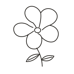
The petals leave open space around the center. Preserve the breaks that give the bloom its irregular shape.
Vector line art from the Tattoo Stencil collection.
This design concentrates on the outer petal shapes and a small oval center. The bloom covers most of the width, while the two leaves spread from a stem that bends slightly to one side. Compare it with the Tea Rose at the same bloom width. The Tea Rose puts more of the drawing into folds around the center, while the Wild Rose leaves long stretches of open petal. The space makes the two drafts useful comparisons when you are deciding how much internal detail you want.
Test the bloom first, then check the lower part of the stem as its own shape. Set a paper proof beside a version with the leaves simplified to their outer edges. That comparison shows whether the narrow veins help you follow the leaves or compete with the outline. Keep the gaps between the petal bases visible. If those gaps become hard to see, try a larger print before adjusting the little oval.
Use the open flower rather than the stem as the main footprint. Cut a paper window to the width you have in mind and see whether it includes the far left and right petal tips without squeezing either edge. For an upper arm or shoulder mockup, try placing the bloom in the broad part of the paper and letting the stem turn toward the narrower side. Mark the downward leaf separately so you can see whether it changes the overall balance.
Set the reference and the proof next to each other in the same orientation. Start with the outline and cover the smaller marks with a separate sheet for a moment. That makes it easier to tell whether a detail is doing important work or only adding texture. Uncover the rest, then note the first detail that looks different between the two copies. Write down whether it disappeared, joined another mark, or shifted in relation to the main shape. These observations give you a way to compare the next draft without relying on the appearance of the zoomed preview.
At a hypothetical 60 mm width for the square SVG artboard, the 2.2-unit strokes scale to roughly 0.55 mm in the digital file. Use that figure only to identify the draft you are comparing. The visible question is whether the short marks around the center remain detached from the oval. If one begins to read as a spoke touching the oval, shorten it from the center end or omit it while preserving the irregular petal edges.
Choose one narrow gap that matters to the subject, then follow the adjacent lines through the preview. The gap can be more informative than the nominal thickness of either stroke. Keep the main contours and compare one version with fewer inner marks. This makes it easier to see whether the outline or the interior detail needs attention.
Check the small bright pocket beside the lower left petal where its contour turns inward. A print can retain the center oval while losing that notch, which makes the bloom look rounder than the source. Compare the original and proof with the stem pointing the same way. If the notch is present in the file but gone on paper, check the print scale before changing the artwork. If it is already lost in the draft, restore the notch and simplify one interior accent instead.
If the artwork spans more than one page, align the repeated lines in the overlap first. Look at both a long edge and a small detail that crosses the seam. A small offset can change the spacing in a detailed section even when the outer edges appear to line up. Assemble the pages and measure the overall width or height again. The actual-size printing guide walks through calibration and assembly.
Pick one feature that makes left and right easy to distinguish and use it to label the proof. A curved stem, an unequal wing, or a letter can serve as the reference point. Check which direction the equipment produces before choosing the mirror option for a working stencil. A paper proof can help you discuss scale and orientation with an artist. Keep the original image, the chosen draft, the measured dimensions, and any alternate version that shows a detail you removed. If you return to the design later, those files make it possible to see which decision you made without reconstructing the settings from memory.