 Tattoo Stencil
 Buy me a coffee
Stencil collection
Fine Line Tattoo Stencils
Compare six fine line tattoo stencils with petal contours, wing veins, and an ornamental profile. See what to simplify before printing at size.
6 designs
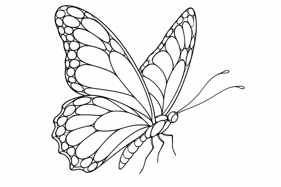
Butterfly
Butterfly in Profile
A three-quarter butterfly with raised wings and outlined wing spots.
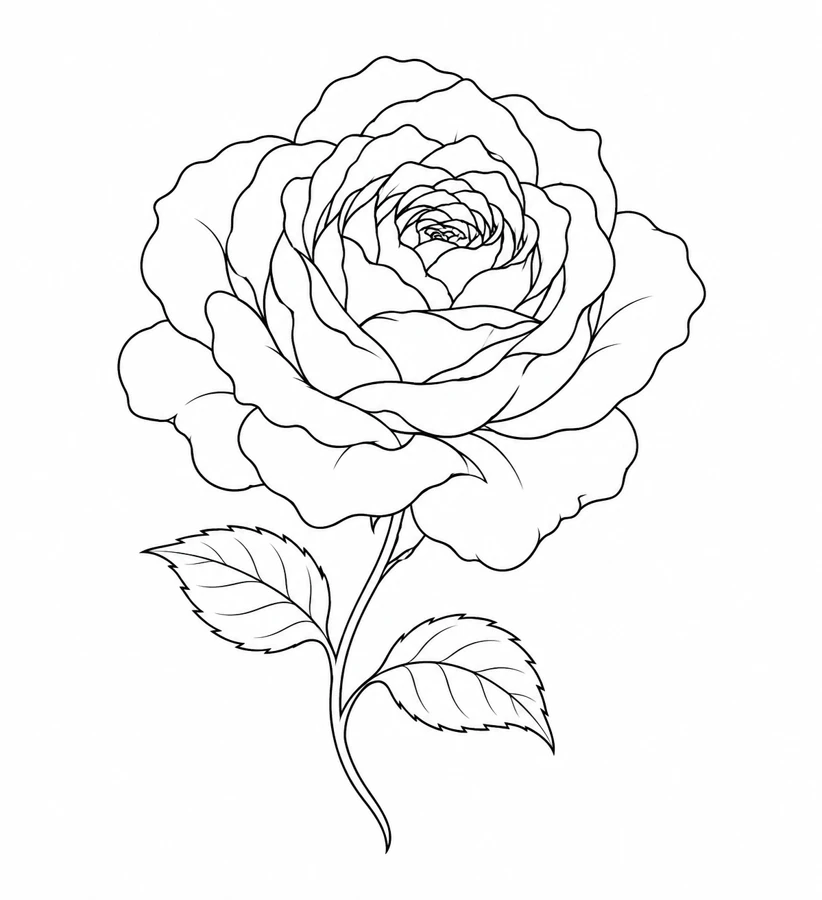
Botanical
Open Garden Rose
An open garden rose with layered petals, a curved stem, and pointed leaves.
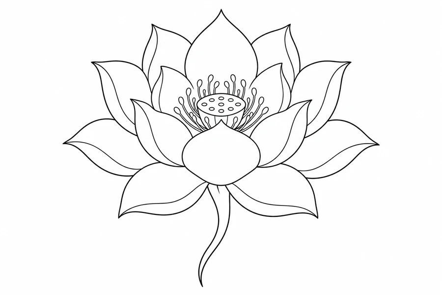
Botanical
Lotus Bloom
A layered lotus bloom with a short flowing stem.
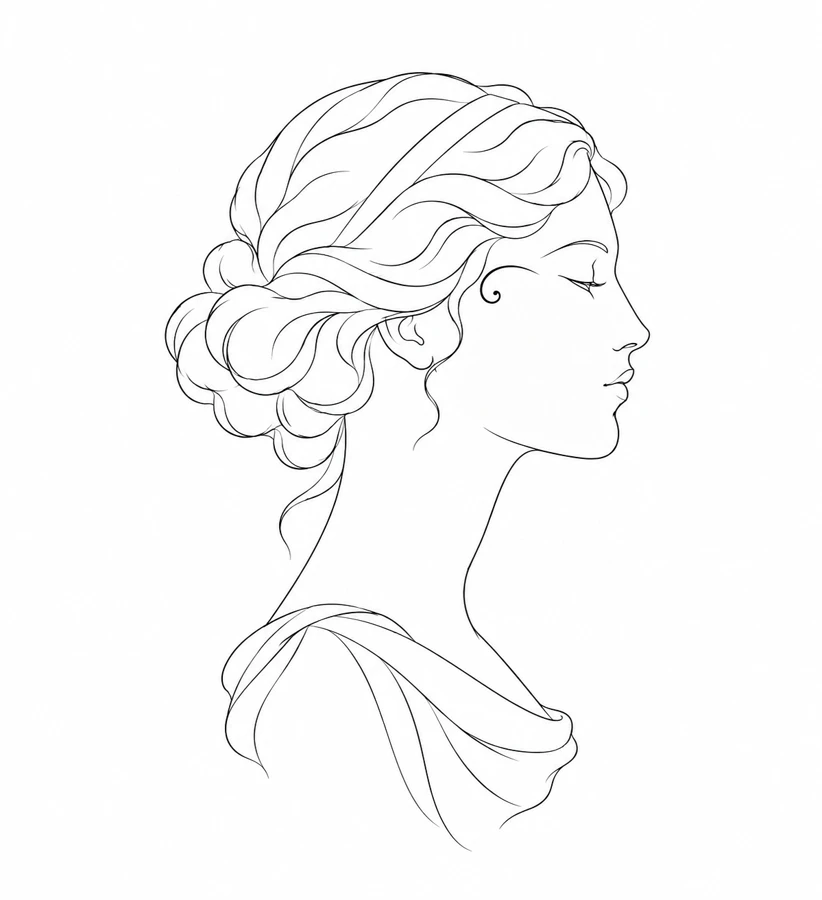
Portrait
Ornamental Profile
An anonymous profile with a small decorative curve near the temple.
Botanical
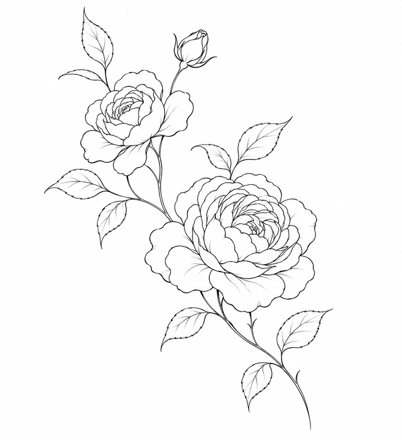
Rose Branch
Two roses and a small bud arranged along a diagonal branch.
Butterfly
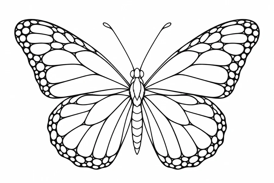
Monarch Butterfly
A spread-wing butterfly with monarch-inspired wing divisions.
Compare fine line tattoo stencils by the gaps between lines
Use the small spaces between contours as a starting point. The lotus and garden rose both have layers of petals, but the rose concentrates its tightest folds in the center. The rose branch distributes small details along a diagonal. Compare which contours remain easy to follow when the artwork is printed at the same width.
The butterfly in profile and the spread-wing monarch let you compare an overlapping silhouette with a symmetrical one. The ornamental profile has a small accent close to the temple outline. On a paper mockup, look at the smallest wing divisions or the space around that temple accent before choosing a size. Narrow designs can be compared along a forearm mockup. For a wider design, check how much room the wings need across the planned placement.
What to check on a paper proof
Use a high-contrast reference and keep the lines that define the shape, then inspect the tightest gaps in the preview. A stronger line may help a broken edge, but it can also close the space beside an adjacent line. If the edge itself already reads clearly, try erasing a small secondary detail first. Compare your revised draft beside the original to check what changed.
Measure the available space and print a full-size proof plus a slightly larger comparison. Match the PDF paper to the loaded sheet and print at Actual Size or 100%. If the smaller proof loses a gap that matters, bring both copies to your artist. The artwork, transfer equipment, and planned placement all affect the final choice of line weight.