 Tattoo Stencil
Design notes
Check the scallops along the outer edge separately from the markings inside the wings.
Artwork source
Vector line art from the Tattoo Stencil collection.
 Buy me a coffee
Butterfly · Tattoo stencil design
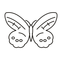
A front-facing butterfly with scalloped wing edges and separated interior markings.
Check the scallops along the outer edge separately from the markings inside the wings.
Vector line art from the Tattoo Stencil collection.
The U.S. Fish and Wildlife Service distinguishes painted ladies from monarchs in part by the eyespots on the underside of painted lady wings. This vector artwork selects several interior markings and draws attention to the scalloped edge. Treat the wildlife images as a reference for the animal and this design as a simplified front view.
U.S. Fish and Wildlife Service painted lady and monarch comparison
Test the span on the upper arm and compare it with a flatter paper layout over the shoulder blade. Check whether the lower scallops can be seen together from one angle.
Discuss which dark patches should be shaded and which need a contour of their own. Use a scallop and the nearest interior mark as a spacing check.
The Painted Lady study combines long diagonal bands in the upper wings with a series of small spots above the scalloped lower edge. Place it beside the Buckeye at the same size to compare a repeated row of marks with two large eyespots. The small spots distribute your attention along the lower wing. In the upper wing, the short crossing strokes divide the band into smaller pieces, which can be a useful place to simplify a tight draft.
On plain paper, follow the outside of one lower wing and see whether its scallops are still separate from the nearest spots. Compare a version with one crossing stroke removed from each upper wing before changing the band itself. A good comparison keeps the position and size of the spots stable while you assess the upper detail. If you plan to place the butterfly across a curved area, try moving the paper centerline slightly and check whether you can still see the lower row from the angle you care about.
Use a shoulder or upper-back paper mockup to see the repeated lower spots as a complete row on each side. Draw a light line through the butterfly body and hold the mockup at the viewing angle you want. Check whether the outer lower scallops remain visible beside the spots. If the upper wings fit but the lower row curves out of view, try moving the paper centerline first. Compare the layout again before shrinking both wings and their markings.
Set the reference and the proof next to each other in the same orientation. Start with the outline and cover the smaller marks with a separate sheet for a moment. That makes it easier to tell whether a detail is doing important work or only adding texture. Uncover the rest, then note the first detail that looks different between the two copies. Write down whether it disappeared, joined another mark, or shifted in relation to the main shape. These observations give you a way to compare the next draft without relying on the appearance of the zoomed preview.
On each lower wing, the two inner spots at the same height are only 15 SVG units apart from center to center. At a hypothetical 72 mm artboard width, their closest horizontal gap scales to about 0.7 mm digitally, accounting for the ellipses and stroke width. Use that pair as the first paper comparison. If the spots print as one mark, compare a version with slightly narrower ellipses while holding their centers in place. Check that all three spots still read as a row.
Check the wing shape before the interior pattern. The body and outer contours should remain visible at the proposed size. In a spread-wing design, compare matching areas on both wings. In a profile, identify the overlap that shows which wing is nearest. Keep that boundary readable when reducing the other markings.
Check where the last lower spot sits near the curved stripe that comes down from the wing root. If the spot and stripe nearly meet, compare the same area on the opposite wing before deciding what to simplify. Then make a second copy that shortens the end of that stripe while keeping the spots and scalloped edge in place. At the same print scale, you can judge whether that small local change restores the border between the pattern and the outline.
If the artwork spans more than one page, align the repeated lines in the overlap first. Look at both a long edge and a small detail that crosses the seam. A small offset can change the spacing in a detailed section even when the outer edges appear to line up. Assemble the pages and measure the overall width or height again. The actual-size printing guide walks through calibration and assembly.
Pick one feature that makes left and right easy to distinguish and use it to label the proof. A curved stem, an unequal wing, or a letter can serve as the reference point. Check which direction the equipment produces before choosing the mirror option for a working stencil. A paper proof can help you discuss scale and orientation with an artist. Keep the original image, the chosen draft, the measured dimensions, and any alternate version that shows a detail you removed. If you return to the design later, those files make it possible to see which decision you made without reconstructing the settings from memory.