 Tattoo Stencil
Design notes
Compare the two directions on paper. The lifted wing gives this outline a different flow when reversed.
Artwork source
Vector line art from the Tattoo Stencil collection.
 Buy me a coffee
Butterfly · Tattoo stencil design
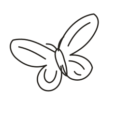
An asymmetric flight study with one wing lifted and the other extending outward.
Compare the two directions on paper. The lifted wing gives this outline a different flow when reversed.
Vector line art from the Tattoo Stencil collection.
The vector drawing is a gesture study. One raised wing, one extending wing, and a tilted body suggest a turn in flight. The outline is designed around that angle and does not identify a particular butterfly species. The strongest clue to movement is the imbalance between the two wing tips.
Set an angled paper mockup over the outer upper arm and try a diagonal along the forearm. Compare which way the high wing directs the eye when the arm is seen from a natural viewing angle.
With an artist, identify the body and two wing contours that make the direction clear. Consider leaving interior divisions light so the wing shapes carry the movement.
In this flight study, one upper wing rises steeply while the other extends across the page. The body leans toward the lower right, and the lower wings end at different heights. Use the highest wing tip and the lowest lobe to measure the full diagonal span. Compare this shape with the spread-wing Monarch if you are deciding between movement along an angle and a centered silhouette. A straight horizontal width measurement alone misses how much space the taller wing needs.
Print two copies at the same size and try one turned so the high wing points into the open space on your mockup. Check the small gaps near the wing roots in both positions. When you simplify a draft, keep the long rising contour and the broader, lower curve on the opposite side. Those two shapes give the butterfly its gesture. Use the leaning body and unequal wing tips as orientation cues when you compare a reversed copy.
Trace the highest wing tip and the far end of the broad opposite wing on a paper mockup. For an angled upper-arm or shoulder comparison, move the whole mockup until the raised wing points toward the widest available area. Check the lower lobe at that same angle. A paper window centered on the body can make the tall tip appear to fit while hiding where the lower shapes actually sit. Compare both extremes before choosing the overall width.
Set the reference and the proof next to each other in the same orientation. Start with the outline and cover the smaller marks with a separate sheet for a moment. That makes it easier to tell whether a detail is doing important work or only adding texture. Uncover the rest, then note the first detail that looks different between the two copies. Write down whether it disappeared, joined another mark, or shifted in relation to the main shape. These observations give you a way to compare the next draft without relying on the appearance of the zoomed preview.
Follow the inside line running toward the tall tip and compare it with the tighter curl inside the low wing on the opposite side. They carry different jobs in the drawing. The high line reinforces the rise, while the low curl is secondary to the round outer edge. If detail is cramped, omit the smallest lower-wing accent first and preserve the long rising contour. Compare both drafts with the body in the same direction so you can judge how the change affects the flight gesture.
Check the wing shape before the interior pattern. The body and outer contours should remain visible at the proposed size. In a spread-wing design, compare matching areas on both wings. In a profile, identify the overlap that shows which wing is nearest. Keep that boundary readable when reducing the other markings.
On an actual-size proof, look where the higher wing bends back toward the middle and check the open space above the opposite lower wing. If that opening disappears, compare the proof with the file using the antennae and tilted body as landmarks. Try a second print with the nearby interior stroke shortened rather than thickening the outside edge. The unequal wing tips should still carry the movement. Label which way the high wing faces when setting a mirrored version beside the original.
If the artwork spans more than one page, align the repeated lines in the overlap first. Look at both a long edge and a small detail that crosses the seam. A small offset can change the spacing in a detailed section even when the outer edges appear to line up. Assemble the pages and measure the overall width or height again. The actual-size printing guide walks through calibration and assembly.
Pick one feature that makes left and right easy to distinguish and use it to label the proof. A curved stem, an unequal wing, or a letter can serve as the reference point. Check which direction the equipment produces before choosing the mirror option for a working stencil. A paper proof can help you discuss scale and orientation with an artist. Keep the original image, the chosen draft, the measured dimensions, and any alternate version that shows a detail you removed. If you return to the design later, those files make it possible to see which decision you made without reconstructing the settings from memory.